ILLUSTRATION
|
Title: 1st generation immigrants
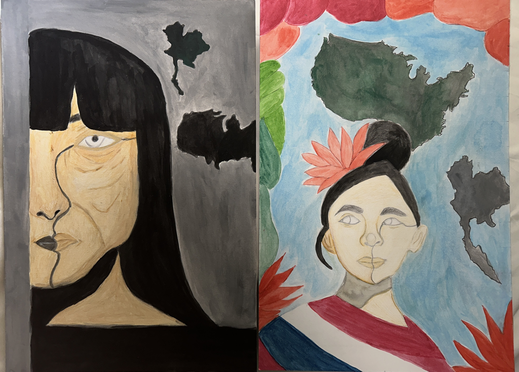
Size: 50.6 x 38.1 cm Medium: Color Pencil and Watercolor paint on illustration board Completion: February 2023 EXHIBITION TEXTThe artwork is titled "1st Generation Immigrants" and it depicts a parent and child who are first-generation immigrants. It demonstrates how the two immigrants are different. It also conveys the emotions of both parties. The illustration of the mother demonstrated the struggles the 1st generation immigrant parent had experienced trying to raise their family in a different country. The illustration also shows a first-generation immigrant child who has lost touch with her roots, culture, and language.
|
INSPIRATION
Artists: Malika Favre

Red by Malika Favre
|

In Bloom by Malika Favre
|
The artwork of French artist Malika Favre has influenced me. Her use of color and intricacy absolutely fascinated me when I first saw her work. With the use of color, I enjoyed how she was able to contrast the light and dark. Her use of shadow in her two sculptures was quite mesmerizing, and it gives them a distinctive touch. When I first saw Favre's work, I knew it might fit with the human subjects I intended to depict in my artwork. I like how she drew the people, and the way she changed the background with different layouts really made the person she drew stand out. I will be able to do this project much more effectively if I learn the skills and methods she uses in her artwork. Looking at her work and wanting to draw people inspired me to consider the subject I wanted to illustrate. First-generation immigrants were the subject I intended to cover for this project. I considered depicting two first-generation immigrants in my drawings (a mom and her daughter). When I initially saw her first piece, "Red," I liked how nicely she was able to mix light and dark colors. Using only white, red, and black to balance or blend color is quite difficult. I found the piece to be distinctive and quite detailed, and I appreciated how she used line, value, and color. The second painting, "In Bloom," caught my attention because of the way she used color in a novel way. I also thought the colors in this artwork worked well together and were well-balanced. I thought it was a fairly tricky approach, but she managed to pull it off, adding black shadow while yet letting some color come through. The harmony, contrast, and attention to detail in her work inspired me even if the meanings of my artwork and hers are different. The first work she created, "Red," didn't really have significant meaning, but I was moved by how skillfully she contrasted and balanced the colors in her picture. The name of the second piece that I was inspired by, "In Bloom," didn't really have a meaning, but the artist was motivated by the people and surroundings of her journey to Mexico, which is similar to what I was aiming for when I came up with the idea for this project.
PLANNING

|

|
The first planning I did was figuring out what I will add to the illustration. I wanted to do at least 2 illustrations. By looking at my inspiration I thought of drawing about 2 people of 1 generation immigrant parent and a child. I was very intrigued by this kind of topic since it reminds me of me and my mother I as we both moved from our country to live in a foreign country/state. I wanted to draw 2 people, one representing the mother and one representing the child, which is why I want to divide up the illustration paper into two parts. The first part I did in planning was outlining the original artist's piece so I can get a glimpse of what I’m working with.
|

|

|
The second part of my planning was figuring out how I was going to draw the two people in the outline of my previous drawing. It took me a while to figure out what kind of expressions I wanted the people to have, but after a couple of tries, I figured out how I was going to set up the two drawings of the people. The first thing I did after I figured out how I wanted to draw the people divided my sketchbook paper in half since I will be also doing that for my final illustration. Once I was done dividing up the paper I then sketched out the first person I was going to draw, which is the 1st generation immigrant parent and the second thing I did was sketch out the second part of the illustration which is the 1st generation immigrant child.
|
|
For the last part of my planning, I decided to fix any mistakes I made in the sketch. Once those mistakes were fixed I then started to outline my sketch, outline my sketch will help me figure out how I was going to draw the sketch onto the final piece, and also when I’m outlining the sketch it will greatly help me with whether I should make any changes, which will help me improve my work and not make the same mistake for the final piece. Once I was done outlining the sketch I then started to experiment with the different colors I had on my sketch. I decided to plan out how I was going to incorporate the different colors into my sketch. Figuring out what colors I will need and adding to my sketch will help me with how I want the final piece to look and it will also help me not make any coloring or blending mistakes for the final piece.
|

|

|
EXPERIMENTATION
PROCESS
|
EXPERIMENTATION
Before I began to sketch my piece onto the final illustration paper, I began to experiment with the different types of color pencils I had to see which color pencil blends well. I was also experimenting with the different techniques of coloring with a colored pencil. Additionally, I made an effort to determine which color pencil would function best on the illustration paper. I had about three different kinds of colored pencils, and I was experimenting with all three of them to see which colored pencils blended best together. I figured that this experiment would help me decide which colored pencils to use on the paper in order to avoid making any mistakes and to create smooth edges in the finished artwork. Besides experimenting with colored pencils I also decided to experiment with watercolor paint. I thought it would be a good combination if I worked with both colored pencils and watercolor paint. I also wanted to see how well this paint would mix and see which color matches the skin tone I wanted. |
|

|
Once I was done experimenting, I began to sketch on the paper I would use for the illustration. For this illustration, you can see that the paper was divided in half because I intended to create two distinct sketches. The materials I used for the sketch were pencils and colored pencils. I started by lightly sketching and griding the first and second persons on the paper with a pencil so that I could simply erase the pencil mark, which would prevent the final piece from seeming too cluttered or having any pencil marks mistakes.
|

|

|

|
Before I did sketch onto the paper, I used a grid creator app and inserted my drawing. This app helped me with how many grid I needed to go by and it also made it much easier for me to reference it into my paper.
These are what I used for my final illustration, this plan helped my process of working on this assignment go a lot smoother and it was very helpful
<------ |

I was having a difficult time sketching the first person onto the paper since I was conflicted with how big or how small I was going to draw the person. Before the paper was divided it was already big. When the paper was cut in half I was wondering how I was going to fill in the empty spaces since the paper did have more space than I anticipated. It took me a while, but after a few measuring and thinking of more ideas of how I was going to fill in the space I finally sketched out the first piece. The grid also helped me out greatly since I was able to figure out which parts I have to sketch into each square. After finishing the first piece, I also fixed any mistakes I made just like I did when I planned the sketch out, in that way my piece won’t look messy.

This is how the final sketch turned out and as you can see I made some few changes to the sketch and added a little bit more to the background.
Once I was done sketching the main part of the illustration I then decided to paint the first part of the piece. When I was painting the first part of the piece I encountered some difficulties. I didn’t like how I was painting or blending in the colors on the face. When I saw that I didn’t like how I colored in my piece I then decided to use colored pencils for the face instead of watercolor paint, when I did that it turned out a little bit better compared to the watercolor. I used colored pencils to mainly outline the things that I drew, but also the part where I thought watercolor won’t look good in that specific spot. I mainly used colored pencils on the face since I didn’t have the right amount of watercolor to make a skin tone color and also because it blended well together. For the background, I outline some of the components with colored pencils and then I painted over them with watercolor.
|

After drawing out the first person I then drew the child on the second half of the paper, just like the first one I also encountered the same problem which was “how big or how small am I going to sketch the person”, but just like the first sketch I did use the same method of measuring, gridding and getting more ideas for the piece. After I got all those griding and sketching done I then did the same thing as my previous sketch which was fixing any mistakes I had, fixing the mistakes will help my coloring go smoothly and make my piece look neat.
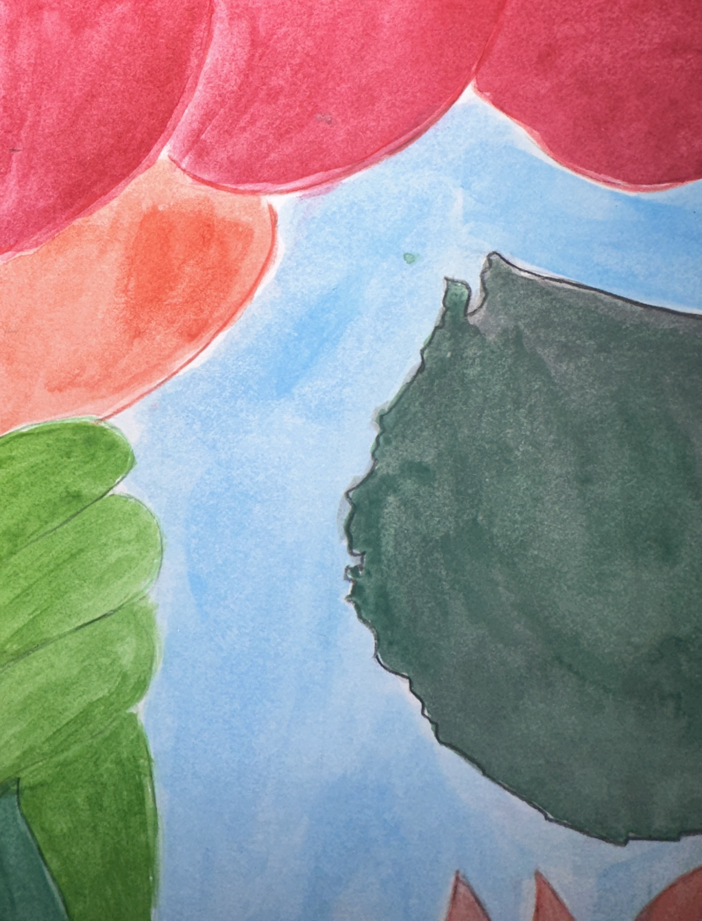
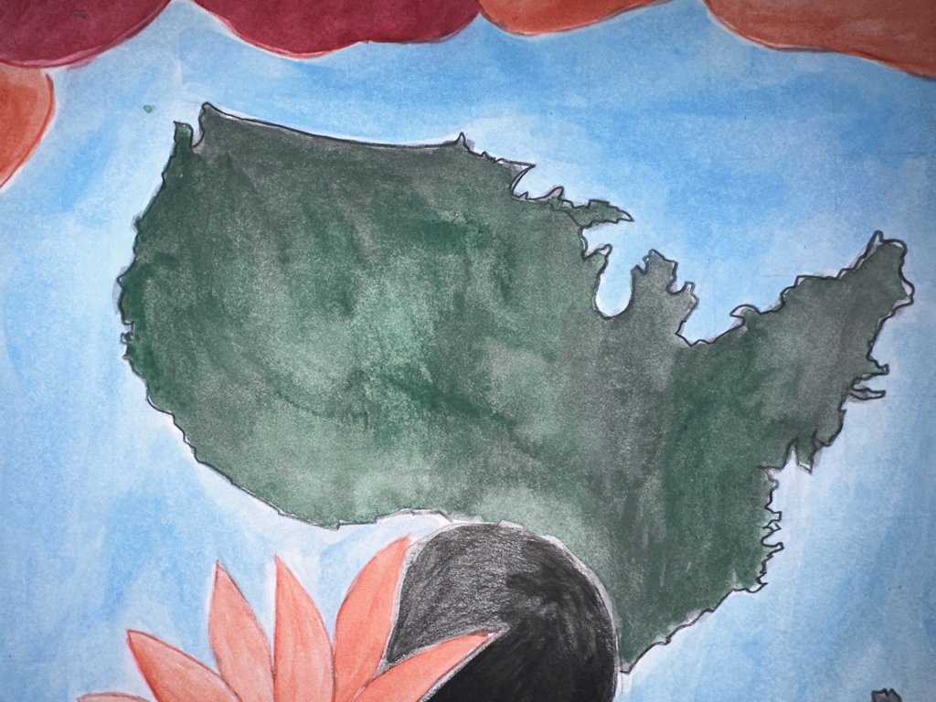
When both of the sketches were finished I didn’t like the way it turned out, so I decided to restart my illustration by making it look much cleaner and neater, this time I instead of drawing random shapes all over the place onto the second illustration of the little girl. I decided to simplify how it looked by adding fewer unique designs that were similar to the artist I was inspired by. I also drew two maps in which they are of the US and Thailand, I did the same thing with the first illustration of the mother, but this time I decided to add more details to the mother’s features, I also erased the map I drew and decided to draw it smaller and next to the mother instead of having one map on the bottom and the other on top. This time I decided on sketching the map near each other.

The picture above are the after picture of when I finished my illustration (I didn't take a picture of when I change some parts when I sketch) , I just wanted to show what I have changed
This is how both of the illustration turned out
|


|
For the final piece, I wanted to name it “1st generation immigrants” since that was what I was going for. The sketch represents the 1st generation of immigrant parents and children. I decided to draw this since it reminds me of the relationship of what I had with my mom and I felt like I could relate with any other people out there with immigrant parents. 1st generation immigrants are people whose parents were both born outside of the US, which is similar to me since both of my parents were born outside of the US. In this piece, I wanted to show the difference between the child and mother of 1st generation immigrants. For the first drawing, I wanted to draw a mother who has been through so many struggles just for her children to live a better life and have good education than she did. For the second drawing, I wanted to draw the child she raised, but the difference is the child seems much happier than the mom. The child didn’t have to experience what the mom had since she’s been given a decent life than the mother did. When I drew this I thought it was a similar situation with my mom except were both much happier now. My mom and I weren’t born in the US, we were both born in a different country, but we moved to the US to live a better life in a safer environment than when we did in our country.
|
|
REFLECTION
I thought that the final part of my piece looked decent. Some challenges I encountered was getting the right measurements when I was going to sketch out my piece. One thing I could’ve improved when working on this piece was my blending, coloring skills and the balance between the person I sketch since I felt some parts of the face I drew felt uneven. The part of this piece that I felt most proud of was how I drew the two people. I felt like I did a decent job of drawing the facial expression. Throughout the process of working on this piece, my inspiration really helped me out a lot since I was able to reference some of the few elements that the artist had on her piece, but also the technique she used when blending in her color. For this project, I developed many skills I didn’t have previously and as an artist I know I will make mistakes, but with practice and having a positive mindset this will help me improve greatly.
CRITIQUE
"Red" and In Bloom by Malika Favre
SIMILARITIES:
|

1st Generation Immigrant
DIFFERENCES:
|


CONNECTION TO ACT QUESTION
Clearly explain how you are able to identify the cause effect relationship between your inspiration and its effect on your artwork?
The cause inspiration had on my artwork is the use of color and details the artist had in her piece. The perfect balance and smooth use of color in her art influenced and affected the way my final illustration looked.
What is the overall approach the author has regarding the topic of your inspiration?
The overall approach the author has regarding my topic is human, how we value people, and or our family.
What kind of generalizations and conclusions have you discovered about people, ideas, culture, etc. while you researched your inspiration?
What I have gathered and discovered throughout my research is that all kinds of people, ideas, and cultures come in different styles and have a unique touch to them. I’ve discovered that artists' ideas come from anywhere like a place, a home, or the moment they're experiencing in their present day.
What is the central idea or theme around your inspirational research?
The central theme of my research is how we value people or our families.
What kind of inferences did you make while reading your research?
Inferences I made around my research were people, how we value them and what is the meaning of family.
CITATION
MLA FORMAT
Montanaro, Gaia. “Malika Favre, an Illustrator Making Her Mark with Bold Color Combinations.” ELLE Decor, 3 Apr. 2020, www.elledecor.com/it/best-of/a32033698/malika-favre-illustrator-interview/.
