ABSTRACT PAINTING
|
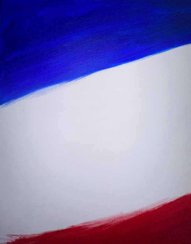
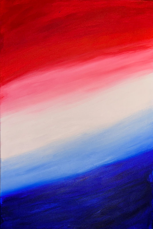
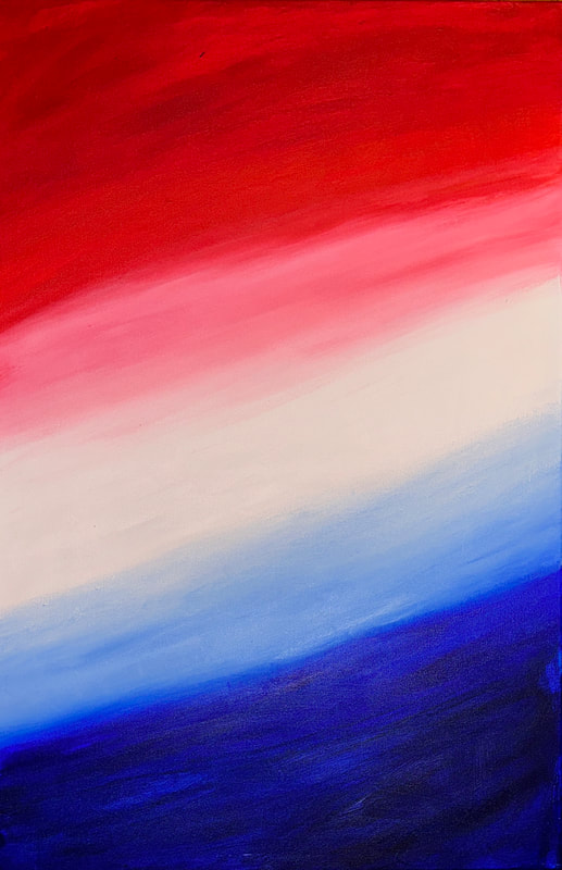
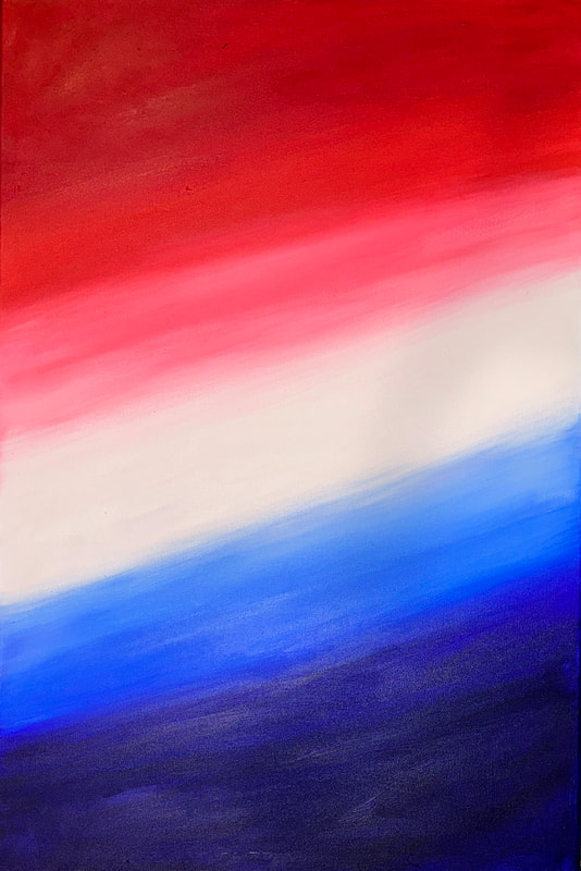
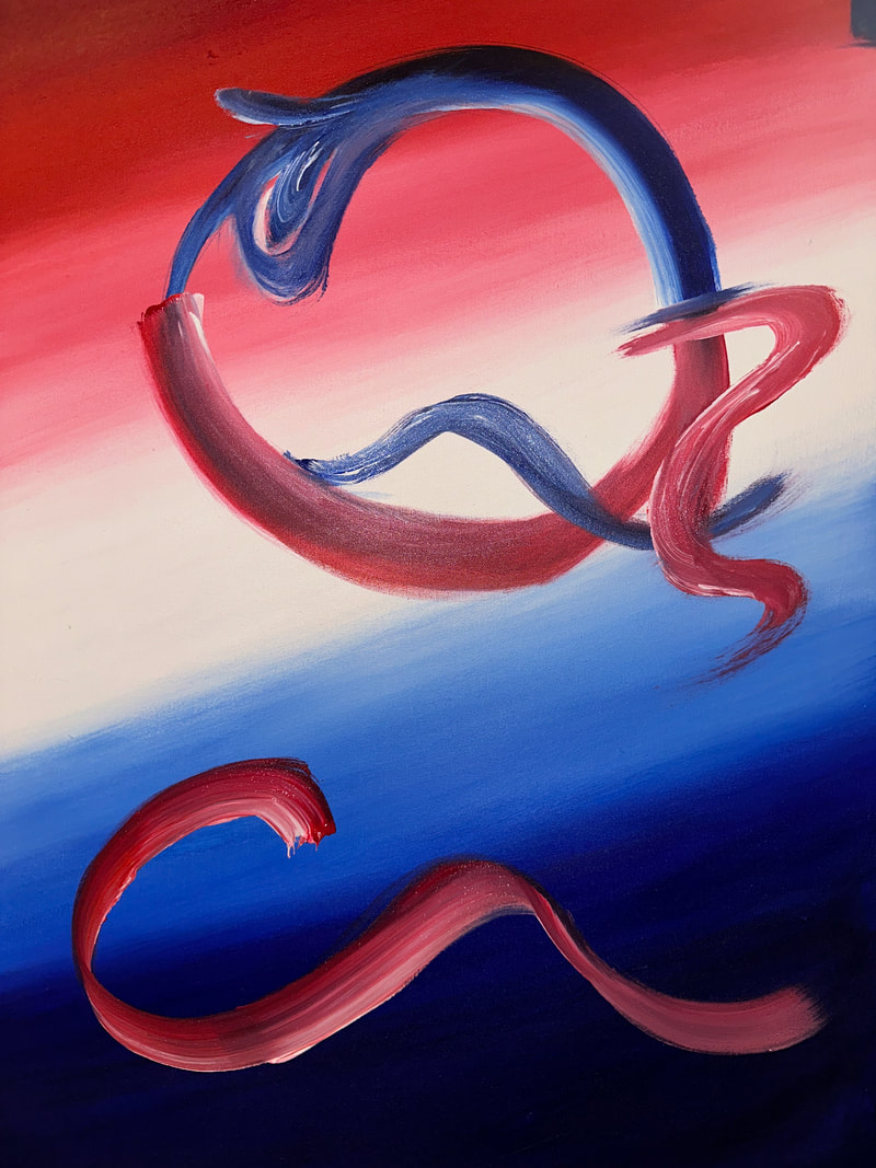
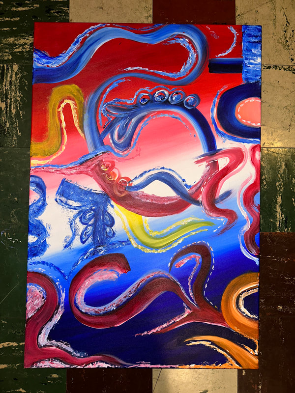
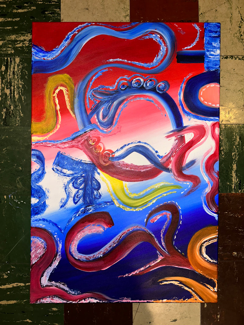
Title: The Color of Karen
Size: 3ft by 2ft Medium: Acrylic on Canvas Completion: EHIBITION TEXT
The Color of Karen represents the Karen flag and it was inspired by paints.v and Gerhard. In the painting the color that was used represents our cultures flags and its significance. Creating this abstract art is a way of representing my love for my culture. The most prominent colors that are seen are the color Red meaning braver, White Purity and Sincerity, and Blue meaning Honesty and Loyalty and together these colors represent who we are as a person and what we believe in as humans.
|
INPSIRATION
ARTIST: Gerhard Richter & v? or paints.v

Abstract Painting by Gerhard Richter
|

Night Bloom II by v? or paints.v
|
I wanted to make abstract art for this project, something I have never done before. They've always piqued my curiosity because they seem so lovely and attractive, which inspired me to paint an abstract landscape. I searched for an abstract artwork to serve as both a source of inspiration and a tool for brainstorming possible painting compositions. I can better plan how I would make the finished product with the help of these inspirations. I came discovered an abstract artwork called "Abstract Painting" which was made by a man named "Gerhard Richter" that didn't exactly have a label when I was looking for inspiration. As soon as I saw this painting, I knew exactly what I wanted to make for my artwork. Just glancing at this image gave me a lot of ideas for solutions. I was drawn to this abstract piece of art because of how masterfully the colors are combined and complement one another. I was able to think of a manner I wanted to organize and plan out the general composition of this painting thanks to the inspiration from it. In addition to this piece of art, I was also influenced by another one, and this one had the precise style and composition I sought for my painting. It included the identical aspect that I intended to use in my artwork. In contrast to the first artwork that inspired me, this abstract painting is more contemporary, and the way the colors were blended in this piece really drew me in. I was able to determine which colors would mix well together as well as how to merge the colors in the picture. The artwork that served as my second source of inspiration is titled "Night Bloom II," and the creator, who goes by "v? or paints.v," this artist hasn't revealed their name. This artist has produced a great deal of abstract art, and she consistently worked with the same media. She works primarily with paint on canvas, and once I begin creating my own artwork, I plan to do the same. Since acrylic paint is the ideal medium for me and I feel like I work better with it than other paints without an acrylic base, I enjoy utilizing it in my artwork. My inspiration for the final artwork came from the overall painting of the modern abstract piece called "Night Bloom II," which allowed me to come up with a concept and design for the piece. My intention is to make an artwork that incorporates the idea of culture, just like all of my prior works of art, which were all centered around the same concept: culture. With the help of the inspiration offered, I was able to sketch out the appearance of my item and utilize it as a guide when I actually started to make it.
PLANNING

|
I made a color palette as my first planning step to determine what colors I needed and wanted to utilize for my painting. I made a selection of hues that would complement one another. For me, this was an ideal place to start because I occasionally don't like the colors I've used in my past artwork. I believe that with selecting the right colors, the piece would appear much better. Making the artwork look attractive also requires carefully selecting colors that complement one another. I believe that picking complementary colors enhances one another. The proper color hues will also enable me to paint more nicely and efficiently because they will facilitate a smoother and slightly faster painting method.
|

|
For the second plan, I was trying to come up with ideas for the composition of my painting. I sketched the canvas facing with different drawings elements on them to see which one looked more appealing. I added the various components that would enhance the paintings' appearance and serve as an example of abstract painting. To assess how nicely everything would go together, I had sketched the areas I wanted to paint. I wanted to do this to determine which of my ideas would work well as my final piece of artwork. I'll benefit greatly from doing this because I do want it to appear respectable.
|
|
The final phase of preparation In order to see how my painting would seem with all of its components, I chose to combine my initial two planning sketches into one. This will assist me with what I need to accomplish when I start working on this painting, thus I felt like it was an essential component of creating my artwork. After I combined those planning sketches I then drew the whole outline of my final artwork because I want to be able to use this as reference when I start planning. I wanted to sketch out how my final piece would look like beforehand because I want to be satisfied with the way it would look at the end. It would also, in my opinion, make the process of creating this artwork move much more quickly and efficiently.
|

|
EXPERIMENTATION
&
PROCESS
|
In the experimenting process I decided to experiment with the different color paints I had. I started to combine the paints together to see how well it would look with each other. I did this in order to see what I could use and need to change in order to make the artwork look nice. This experimentation gave me a better overview of the color choice I could use in my painting. The experimentation didn’t take as long as I thought it would and I was happy with the results as it helped me think of a better idea of how I wanted my painting to look. I’m glad I did this and with the help of the paint experiment and my last planning sketch this will help me greatly when I start to paint.
|

|
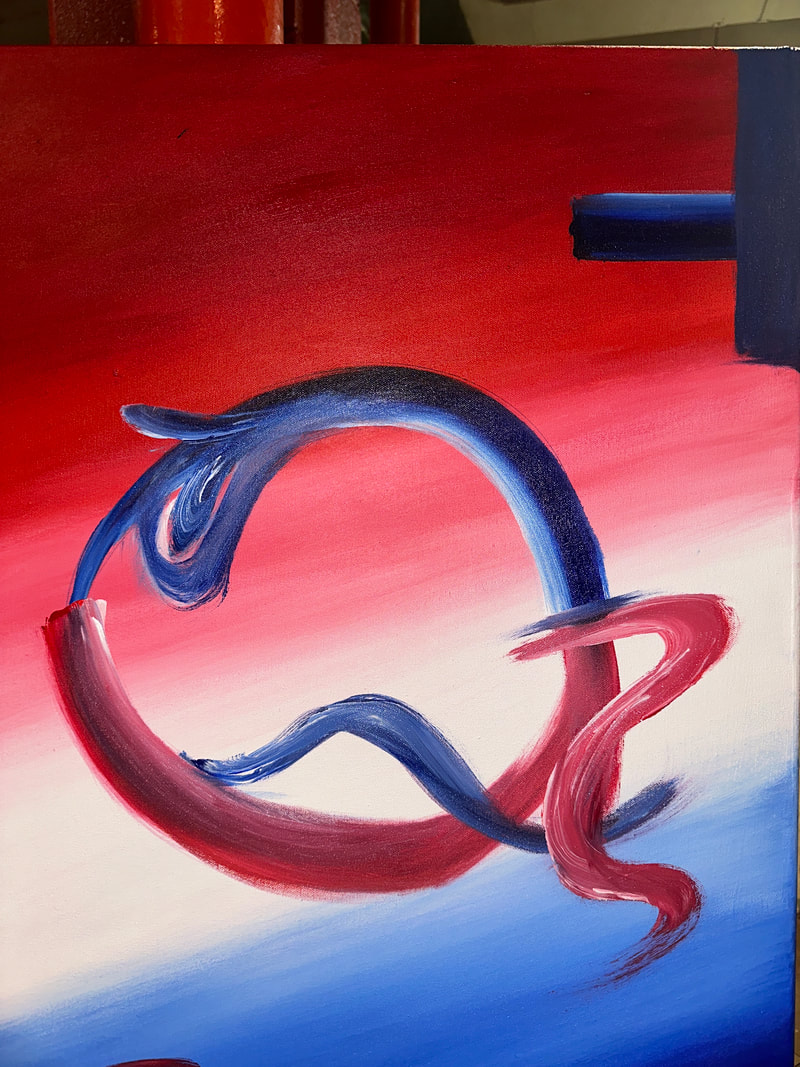
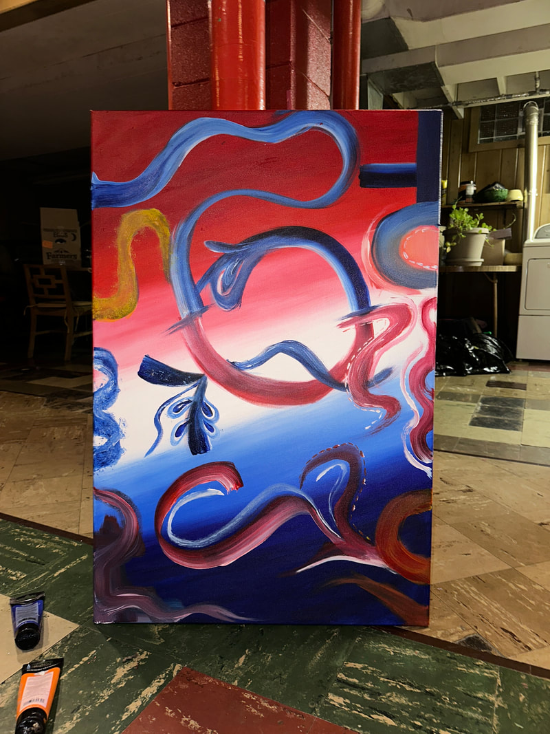
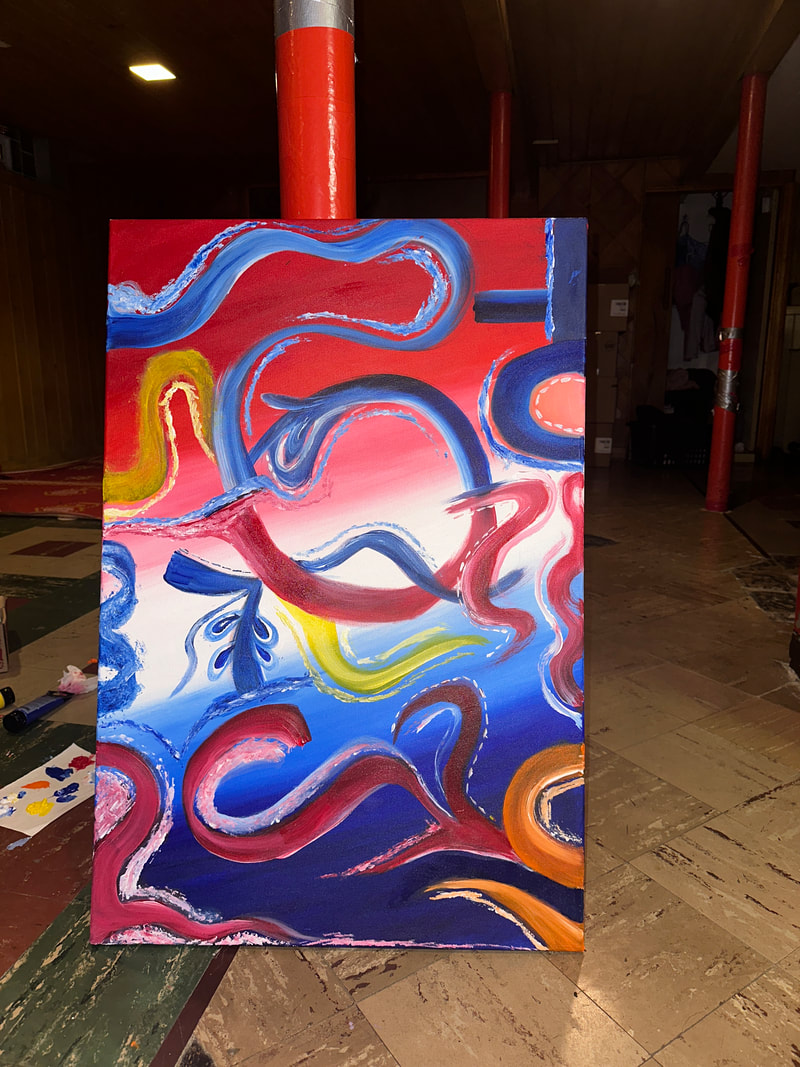
The first part of working on creating this piece is I first started to paint the background. The color I chose for the background was red white and blue. I decided to paint a gradient with the colors I chose. The colors I chose specifically for the background will also be used more than once and I wanted to stick with these colors as it represents my culture and the flag from my culture.

|
|
|
|
At first when I was done painting the background, I thought it didn’t look well blended out. Since this was a problem I decided to go over and paint it again the next day in order for it to look smooth and blended nicely.
Once I was done with the background I decided to paint over the background with random lines and shapes. For this process I used different colors that would go well with each other. This part of the process was all freestyle just like from my second planning where I took the fourth idea and decided to paint whatever comes to mind that would make the artwork look good.
|
|
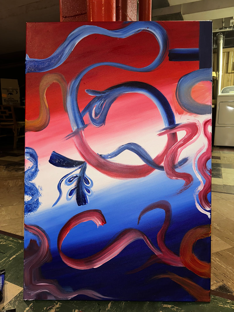
When I started painting other elements for the art piece I started off with combining the same colors I used for the background. I had used red and white paint and decided to paint over the blue background while I used blue and white paint to paint over the red background. After I was done with this I had then decided to add other colors for the background such as orange and yellow since these colors were also about my ethnic flag.
|
|
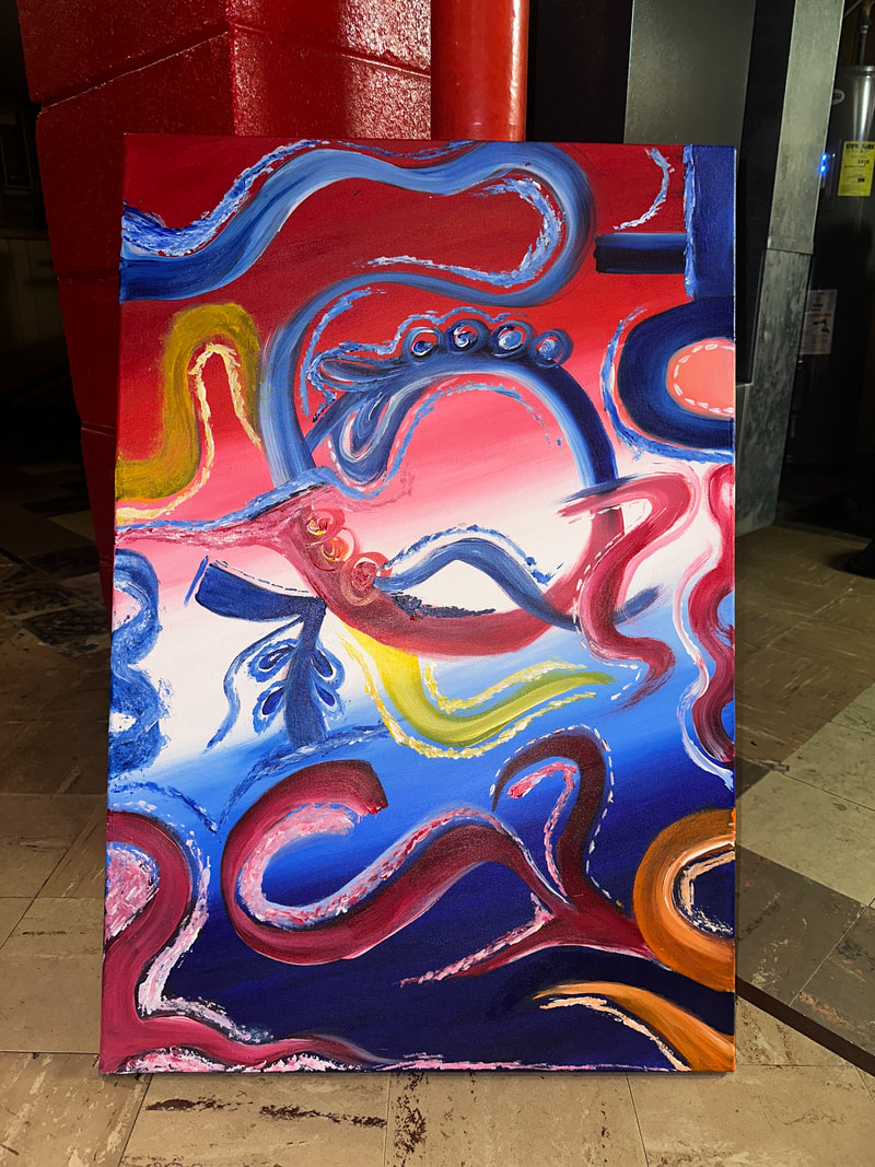
For the corner at the bottom left, I thought it didn’t look too good and so I decided the next day I would paint over it with red paint along with white and red dots all over it. Once I was done with that I then decided to add other elements to the painting like adding dots and different shapes to make the painting look a little bit better and not too empty.
|
|
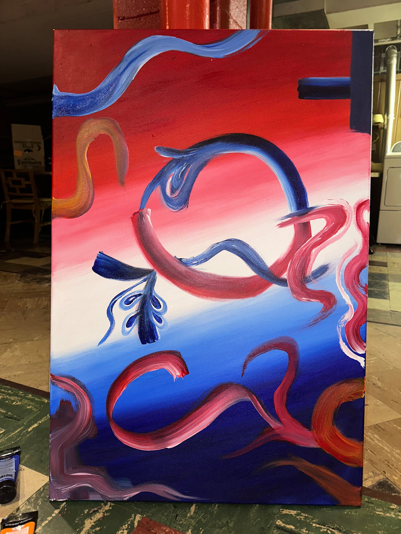
Once I was done with that I decided to take a look at the painting again and I thought it still needed something and so I went back over it again. After I was done with that the painting was finally done
|
|
The pictures below is how the final artwork turned out
|
|
REFLECTION
I thought working on this project went extremely well overall, and I had a great time creating it. One of my favorite aspects of this project was the creation process since it allowed me to produce something I had never done before. I think my finished piece of art looked okay overall, and since it was enjoyable to create, I would like to create more artwork of this kind in the future. The way the backdrop gradient was painted is the one thing I would change to improve the final product's overall appearance. I wish I could have blended it better because it doesn't look very good. If I were to do this again, I might just use one color instead of two, but even so, I'm okay with the two different colors because they were meant to symbolize my culture. Aside from my need to correct the background, I thought the artwork looked decent considering it was my first abstract painting.
CRITIQUE
DIFFERENCES:
|
SIMILARITIES:
|

CONNECTION TO ACT QUESTION
Clearly explain how you are able to identify the cause-effect relationship between your inspiration and its effect on your artwork?
The cause from the inspiration I chose had an effect on my artwork on how I was going to create my piece.
What is the overall approach the author has regarding the topic of your inspiration?
The overall approach it has regarding my topic of my inspiration is the way the artwork was created and how it can influence the way I create my artwork.
What kind of generalizations and conclusions have you discovered about people, ideas, culture, etc. while you researched your inspiration?
The general conclusion I have regarding the people, ideas, and culture while researching for my inspiration is that many artists create their piece by referencing their surroundings, their cultures, and others, which made me want to do the same for my artworks I create.
What is the central idea or theme around your inspirational research?
The central idea around my inspirational research was culture. I wanted to show others the importance of one's own culture.
What kind of inferences did you make while reading your research?
The type of inferences I made while reading my research was color and the significance it could mean to others, but also culture and why it is important to others.
CITATION
CITATION IN MLA FORMAT
- Uncategorized. “Artist v? Pushes the Bounds with Brightly Coloured, Gestural Pieces.”UnSEEN Journal, 4 July 2023,
- unseenjournal.com/artist-v-pushes-the-bounds-with-brightly-coloured-gestural-pieces/. Accessed 15 Nov. 2023.
